Monitoring
This article explains how to work with Monitoring view which show data statistics in structured charts.
In Monitoring you can work with six interactive charts. By clicking on every element with numeric value, you are redirected to Discovery view. For more information about Discovery view, please head over to Discovery view section.
With standard settings you can see 2 charts per line. This can be changed to 1, 2 or 3 charts per line. To see every chart in full screen, click on magnifying glass icon in the upper right corner of every chart.
To find out more information about each chart, click on speaking bubble with question mark icon on the left by full screen icon.
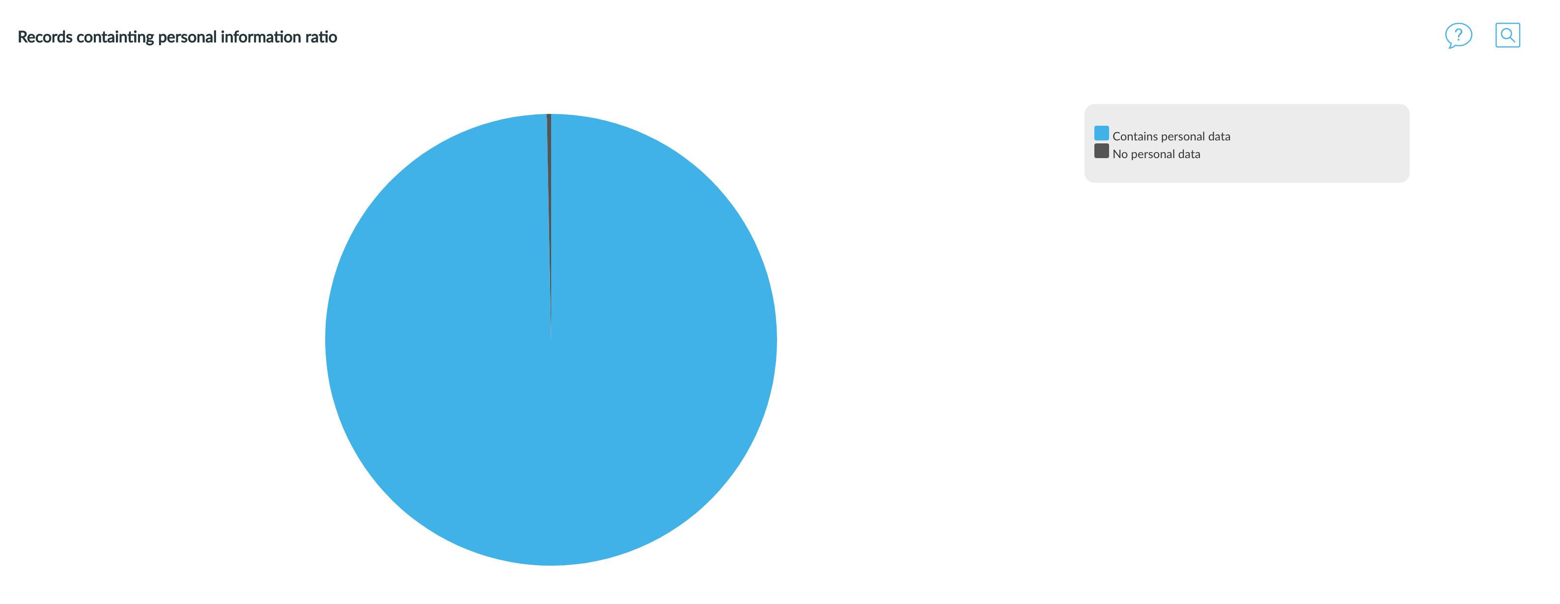
Records containing personal information ratio
First chart shows the ration between files that contain any personal information and those completely free of personal information. The pie chart is interactive, you can click on the part which represents "Files with personal data" and it takes you to Discovery with predefined filer "Contains Personal data:YES" and list of records containing any personal information is shown.
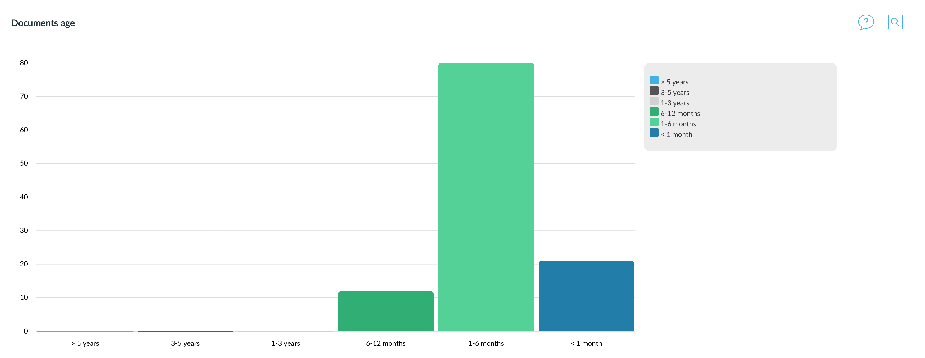
Documents age
Second chart shows a histogram of records last modification date. The column chart displays the time since last record modification in ranges from more than 5 years old to less than 1 month old. The horizontal axis represents time, the vertical axis shows number of documents. The chart is interactive, click on any bar with numeric value and it takes you to Discovery and shows you the corresponding records. The last modification date doesn't apply on data from database record as database records usually don't have last updated date. Only documents are listed in the chart.
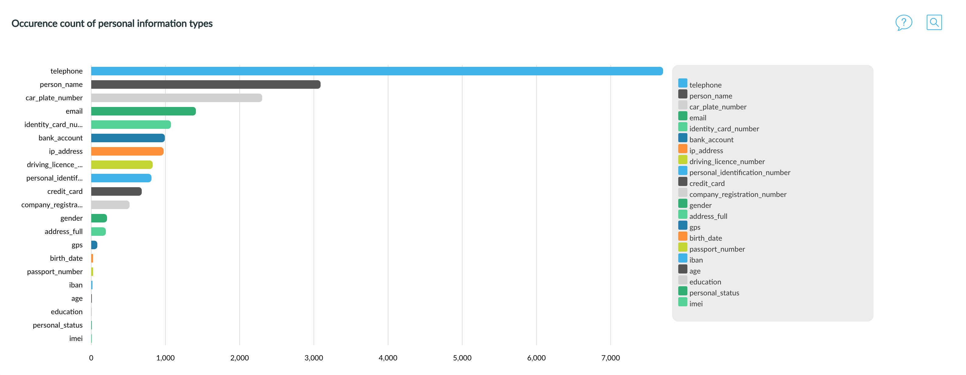
Occurrence count of personal information types
Third horizontal bar chart represents histogram of the most common personal information (annotation) types on vertical axis and number of documents containing that particular time on horizontal axis. The chart is interactive, click on any part with numeric value and you will be redirected to Discovery view and the corresponding records will be listed.
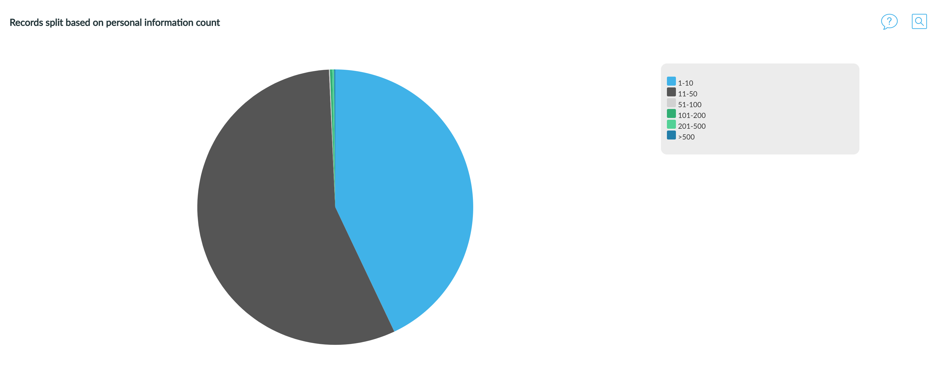
Records split based on personal information count
Fourth pie chart shows number of documents with specific amount of annotations. It indicates in how many documents there are 1, 2, 3, 4 or more than 5 annotations. The attached image shows that more than half of the documents have more than 5 annotations in them. The chart is interactive, you can click on any segment with numeric value and it takes you to Discovery page with corresponding records listed.
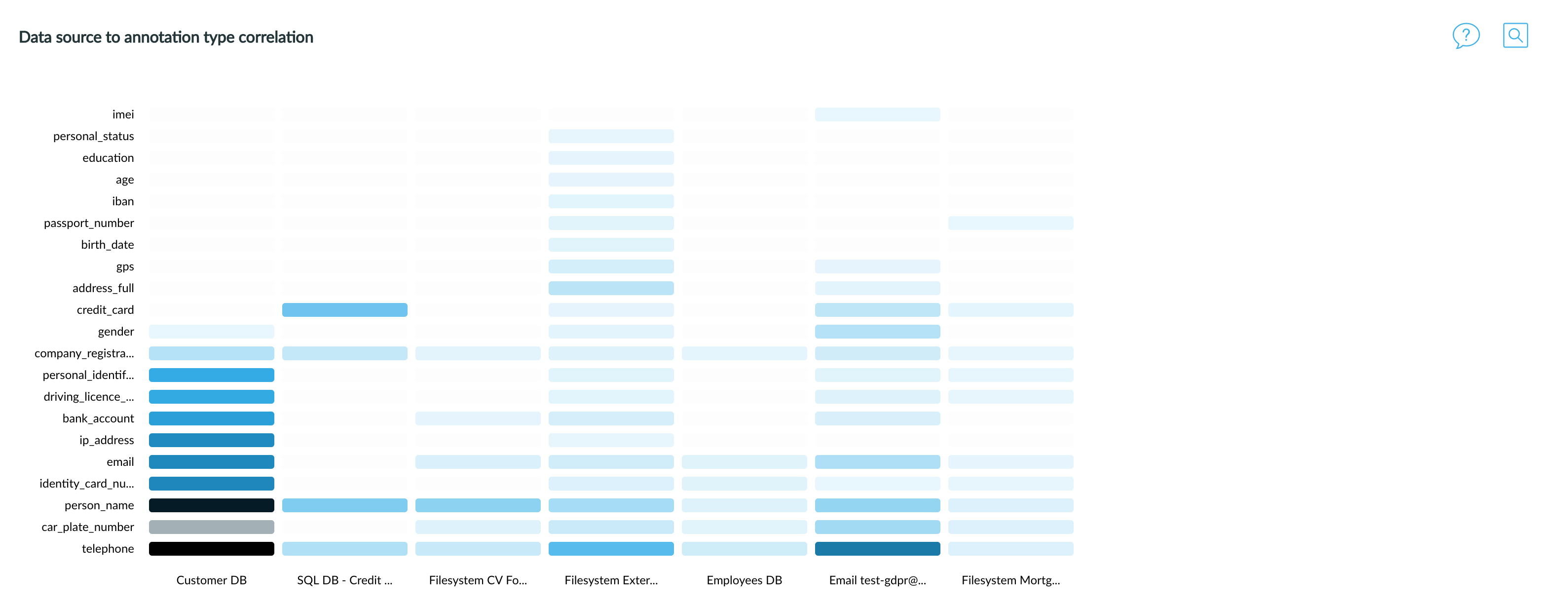
Data source to annotation type correlation
Penultimate chart is a heat map of all annotations in different data sources. Horizontal axis represents data sources (your source systems), vertical axis is the list of the most common personal information. You can see frequency of each personal information type in that data source based on its colour - the darker the blue colour is, the higher the frequency of data. The chart is interactive, you can click on any field with numeric value and it takes you to Discovery page with corresponding records listed.
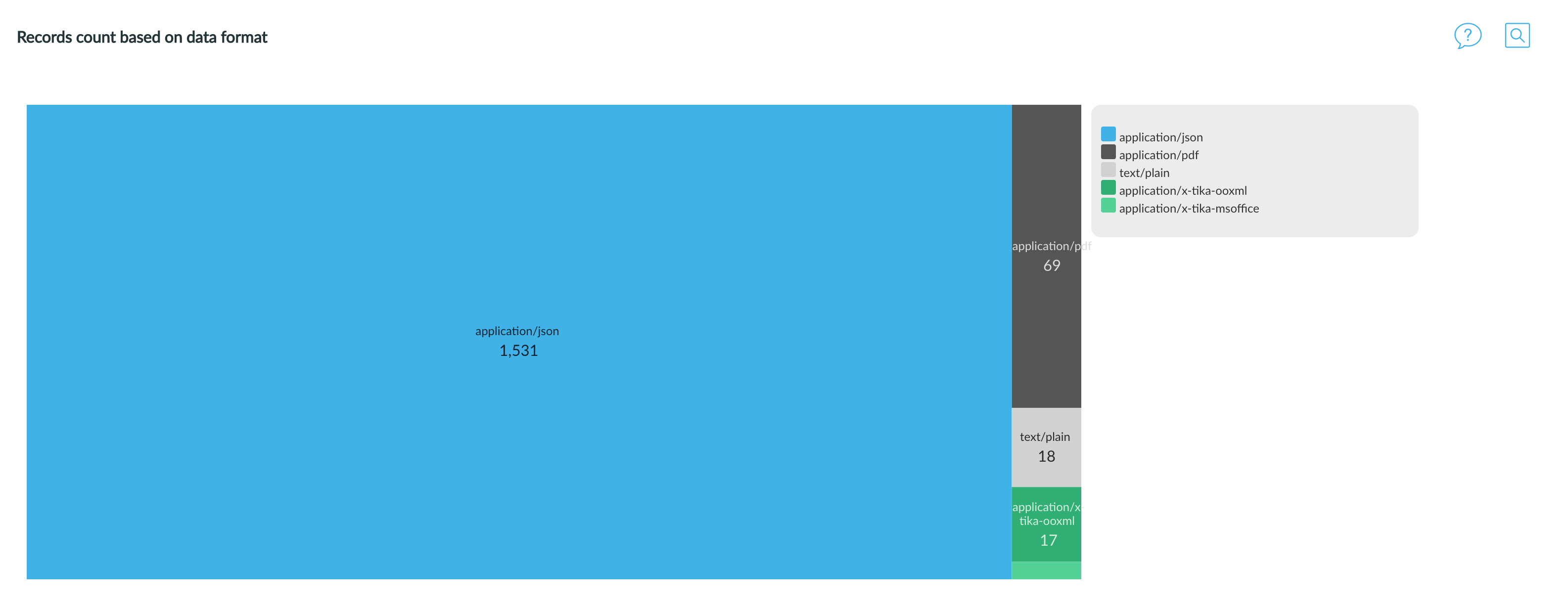
Records count based on data format
The last chart shows the count of personal information on horizontal axis and record mime-type (pdf, txt, etc.) on vertical axis. The chart is interactive, you can click on any bar with numeric value and it takes you to Discovery with predefined corresponding records listed.
Next topic: Discovery
Get me there: